Description
PixelHeaven is a gaming platform designed for multiple devices. It allows users to browse best-selling games, participate in auctions, engage in community discussions, track achievements, and customize their profiles. The app aims to create a fun and dynamic environment where gamers can explore, connect, and trade.
Link to the updated prototype: https://www.figma.com/proto/RKSnJRelpiJa7JTxyS6oQQ/Michelle-Wu?node-id=166-4820&t=HER4APqDbVOMPLB9-1&scaling=scale-down&content-scaling=fixed&page-id=166%3A1472
Feedback Summary
The main usability concerns centered around the lack of confirmation after payment and the absence of a way to recover forgotten passwords. On the accessibility side, text readability and button size needed adjustments to better support all users, especially those on mobile devices.
Design Updates
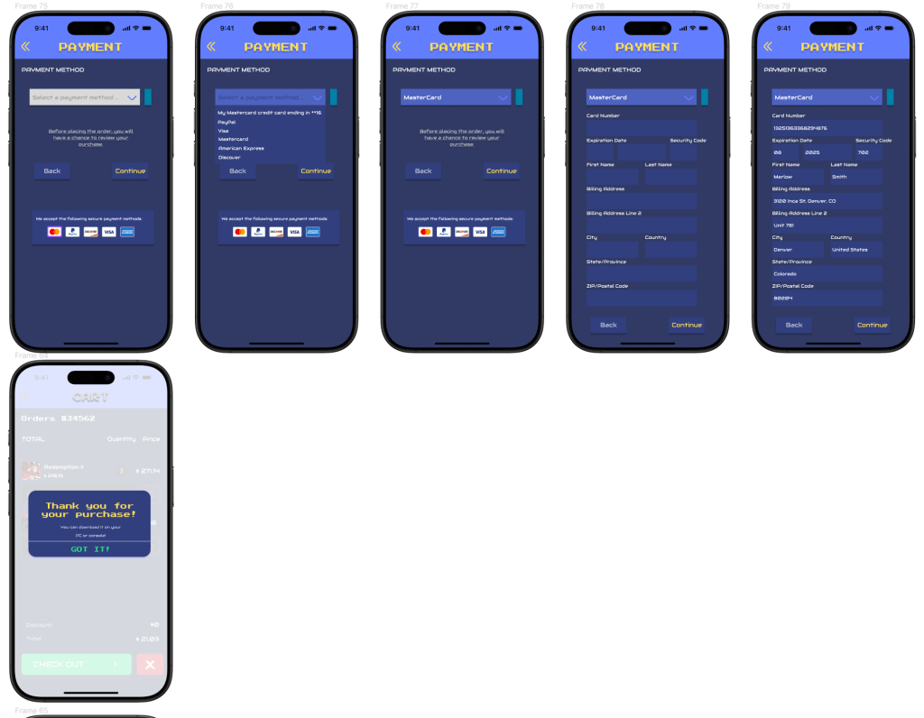
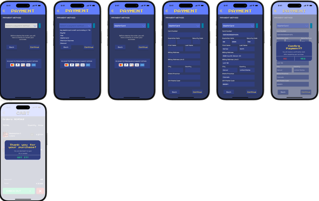
Usability Issue 1: Adding Payment Confirmation Page
Problem:
In the original design, there was no clear confirmation message after users completed a payment. This caused uncertainty about whether the transaction was successful.
Solution:
I added an extra confirmation step asking users if they are sure they want to proceed with the payment. This helps prevent accidental purchases and provides users with a clearer sense of control before completing their transaction.
Before:
After:
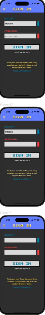
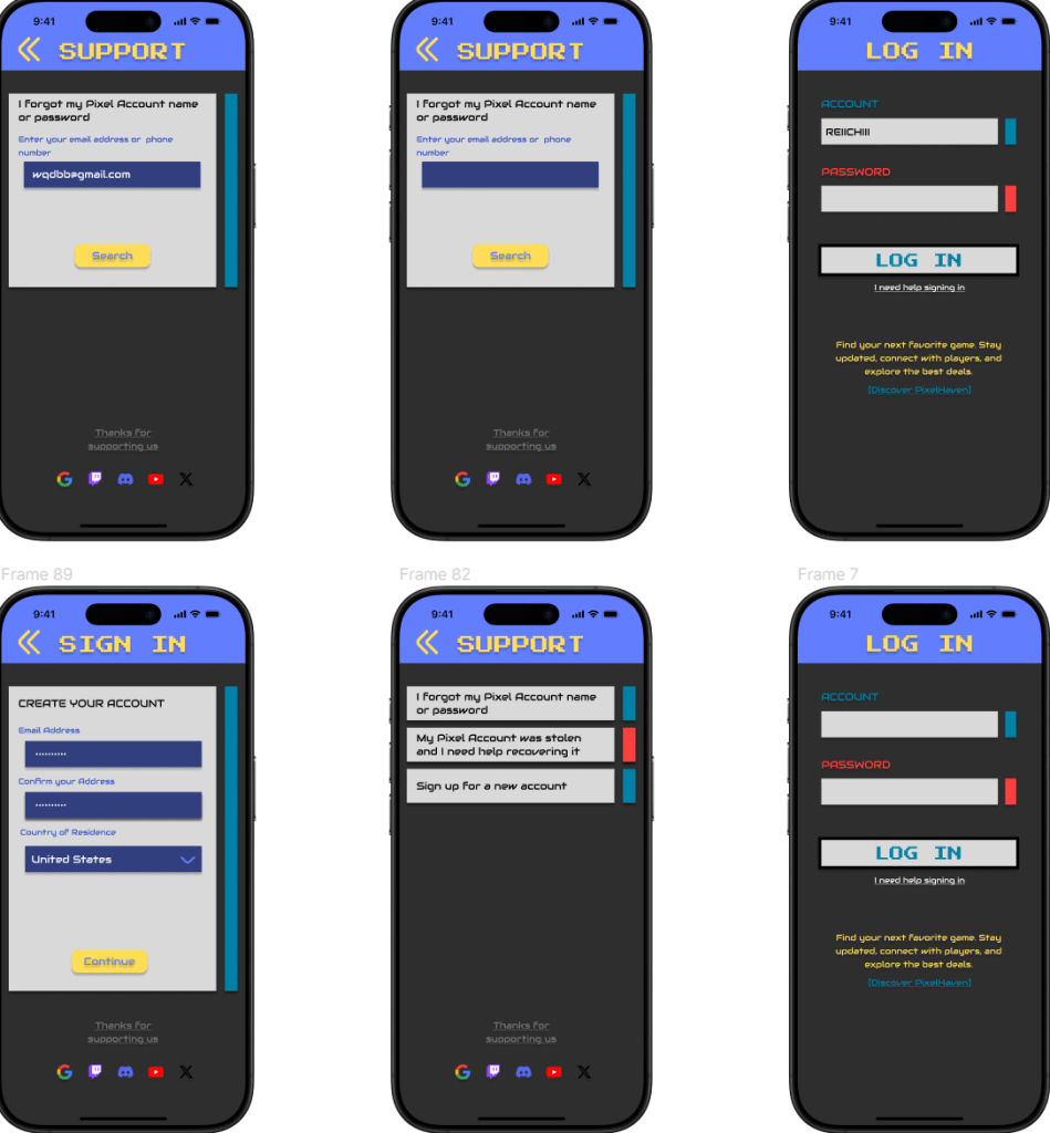
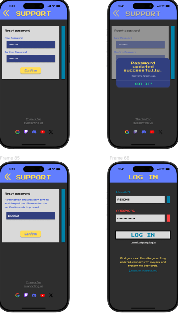
Usability Issue 2: Adding Forgot Password and Sign Up Screens
Problem:
The original flow lacked a “Forgot Password” option and a fully separate sign-up process for new users, creating difficulties for users who forgot their login credentials.
Solution:
I added a “Reset Password” page where users can retrieve their accounts by entering their email or phone number, and I designed a dedicated “Sign Up” page for new users.
Before:
After:
Accessibility Issue 1: Improving Text Size and Typography
Problem:
Some of the text elements were too small, making it difficult for users to read comfortably, especially on smaller screens.
Solution:
I increased the body text size to between 13px and 16px, adjusted the line spacing to 1.5x the text size, and ensured that all fonts used are clear and readable.
Before:
After:
Accessibility Issue 2: Increasing Button Size
Problem:
Some buttons were too small to tap easily, especially on touchscreens.
Solution:
I increased the minimum button size to 40×40px across the app. This ensures that all tappable elements are large enough to meet accessibility guidelines, enhancing the overall user experience.
Before:

After:

Through this project, I realized that even small design changes can make a big difference in improving the user experience. It made me understand how important paying attention to details is, especially in UX design.
I also learned that UX design is not a one-time process. It needs to be tested repeatedly on the actual platform where the app will be used, because certain problems only show up during real interactions. For example, I didn’t realize before that some of my color choices and font sizes were hard to read on a mobile app. Thanks to this round of usability and accessibility testing, I was able to catch these issues and make meaningful improvements.

Leave a comment